This highly practical guide covers:
– the key information clients need to know about multilingual dtp,
– what to do (and not do!) when managing multilingual projects,
– design elements that cause problems in other languages,
– key issues to watch when typesetting foreign language text.
It’s indispensable reading for any client or designer wanting to avoid the common mistakes and consistently produce high-quality foreign language materials.
Don’t have time to read the whole guide right now?
No worries. We have a free e-book (pdf) you can download and read when convenient.
Go there now
Multilingual desktop publishing – what is it?
Multilingual dtp is the process ofconverting and adapting an existing graphic design document or publication into other languages.
It involves 3 steps:
1. translating the text into the required languages
2. typesetting those translated texts
3. producing the required output (digital or print)
However the term is also used in a broader sense to simply mean producing documents and publications in different languages.
The difference is the narrower definition always involves:
• graphic design programs/files, and
• therefore requires typesetting the foreign language texts.
In contrast the broader definition would include producing documents in Word or PowerPoint for example.
This is important as both using graphic design programs and typesetting foreign text require special know-how and expertise.
This guide refers to the first, narrower definition. Examples would be converting your company brochure into other languages. Or your business cards. Or your marketing or product materials.
Multilingual dtp essentials – what every client needs to know
What materials require multilingual dtp?
Any materials produced in a graphic design program.
These programs are used to create brochures, books, posters, packaging, branding, and more – just about anything that combines text and images.
In fact, if your materials have graphics or images and aren’t Word or PowerPoint documents, they’re highly likely to be graphic design files.
What programs are used for multilingual dtp?
These days Adobe products rule the roost – typically:
- InDesign for multi page publications
- Illustrator for more graphic-dominated, generally single page materials, or
- Photoshop
QuarkExpress, which once dominated the market, is still preferred by some designers.

Hot tip: The File, Properties, Description menu in Acrobat will often show you what program (application) a pdf was created from.
Who does it?
Projects will typically involve:
• the graphic designers who produced your original document, and
• a translation and typesetting services company (like us).
Your graphic designers will generally start and finish a project:
• they’ll prepare and forward the files to the translation company, and
• produce the final output.
In between, the translation company will:
• translate the text(s) into the required languages,
• typeset those translations in the designers’ file(s).
Variations
• Occasionally clients will use different companies for the translation and typesetting steps.
• Some clients have their own translators, with the translation house doing just the typesetting.
• And sometimes clients will want an independent review of the translations added to the process.
What is typesetting?
Typesetting is the process of arranging and correctly formatting text in a graphic design file.
What multilingual typesetters do
The typesetter will first import the translation into the design file, then adjust and re-format the text so it:
• displays correctly
• fits the available space
• follows the rules and conventions for that language
• looks good and can be easily read.
They’ll also make sure:
• overall page layout is appropriate and attractive
• there is consistency of style across the publication.
The final step is to print out the new language versions and proof them thoroughly. This is a vital part of the process and generally involves more than one person.
Often the translator will be required to sign off the typesetting before delivery.
5 things a multilingual typesetter will typically need to adjust:
- fonts – especially for languages written in other scripts
- text box sizes – because translations are invariably of different length to the original text
- text point sizes – so it fits optimally into the available space
- line spacing (called “leading”) – for visual appeal, neither cluttered nor overly spaced out
- text styles – existing ones re-defined or new styles created for each language
The five requisites for multilingual typesetting
To correctly typeset foreign language text as part of a multilingual dtp project, requires the following:
1. Software/fonts
- standard English design and word processing software
- a range of quality fonts for each language
- specific programs or plugins for certain languages– eg the Middle Eastern version of InDesign is needed to handle right to left languages such as Arabic
2. Design program expertise
- familiarity with industry-standard layout and output techniques and processes
- particular expertise with formatting text – multilingual dtp often requires significant adjustment of the original text settings to fit translated texts into the available space
- how to use the World-Ready Composer
3. Knowledge of the language(s)
- to confirm all text is displaying correctly
4. Knowledge of language-specific text conventions
- which fonts are appropriate and when
- the dos and don’ts for layout and design that need to be followed
5. Language-specific layout techniques and workarounds
- The unorthodox typesetting techniques and solutions needed for the tricky scripts and languages
Someone who doesn’t tick all these boxes is likely to produce typesetting that doesn’t follow all the target culture’s “rules”. That means it won’t look so appealing to the target audience, or get the response you’re after.
Multilingual typesetting in certain languages is tricky, so don’t take a risk with someone lacking the necessary experience and expertise.
Why you need experts every step of the way
Don’t even think about using amateurs for your multilingual dtp projects – it’s a recipe for disaster!
The success of your materials depends on everything being done well.
In fact, done very well.
Here’s why you need to use professionals for each step:
1. Professional translators will ensure your foreign language texts are fit for purpose
That means translations that are accurate, well-worded and convey the message in an appropriate way. This takes a certain skillset, and there are sound reasons why most bilinguals don’t make good translators.
And if you need more convincing, here’s the process pro translators know to use, but amateurs generally don’t.
On top of that, there’s the additional QA steps quality-focused translation companies like us carry out as standard practice …
2. Experienced multilingual typesetters will ensure all foreign text displays correctly and page layout is appropriate for the target cultures
Below we cover the mistakes typesetters unfamiliar with a language typically make – and have no idea they’ve made.
How the text is presented on the page has a huge impact on how readers respond to a publication, and therefore how successful it is. So don’t take a risk with someone who might do a poor job because they don’t know what they don’t know.
3. Design, print or pre-press experts will ensure the output is exactly right
Output can be surprisingly tricky, with many different settings to get right.
Translation companies generally don’t have designers or pre-press experts in-house, only multilingual typesetters. So for most projects it’s best to leave the output processes to your designer or print specialist.
The keys to successfully managing a multilingual dtp project
1. Sort these 3 essentials before you begin – to nip potential issues in the bud
(a) Make sure your text is really ready for translation
Please don’t do what some clients do!
Send through a project without first reviewing the texts to confirm they’re 100% relevant and appropriate for the target markets.
Pretty obvious – but easy to overlook.
Here’s a partial list of things to look for:
- Are there sections or references that won’t apply to foreign clients/markets? Eg contact details, regulations, other services/products
- Any culturally specific text or wording? This may be lost on foreign language readers, or elicit a different response than intended.
- Have you used jokes/puns/plays on words? These seldom translate easily or well, so re-wording is recommended
- Any product names? The translators will need to know what name these are sold/marketed under in the target market
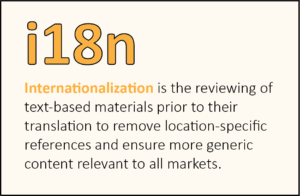
You may want to consider “internationalising” your text before sending it for translation.
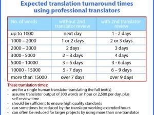
(b) Confirm your project time frames are realistic
Many clients underestimate the time needed for a multilingual desktop publishing project.
We can very quickly tell you how long we’ll need, so just ask!
And our quotes always include our time frame.
Our guide to realistic translation project times might also be useful.
Important: It’s wise not to try to squeeze reasonable time frames!
Doing so means the project will have to be rushed, which greatly increases the chances of mistakes. And that of course will affect the quality and effectiveness of your materials.
(c) Ensure the typesetters see the layout early on
Texts typically expand in translation, often significantly – see why here.
This means it can sometimes be difficult for typesetters to fit translated texts into the space available in the design file.
Identifying this early on will provide time to adjust the layout or design. These tweaks can make a big difference to the overall quality of the other language versions, and reader response to them.
Conversely, you don’t want to discover any issues in the final (typesetting) phase when the pressure is on to finalise the project. The project would either have to be delayed, or the typesetters would have to just do what they can knowing the result isn’t ideal.
It’s just a matter of the designer sending the typesetters a pdf of the artwork at the start of the project so they can assess the layout.
2. Choose the right providers – and you’ll get a dream ride
(a) Your design/print professionals
It’s always best to involve the designers of your existing materials in any multilingual dtp project.
Why? Because they:
- have all the required files
- are familiar with the design, and so
- are best placed to work with the multilingual typesetters to produce the other language versions.
If that isn’t possible, you’ll need to get all the files from them.
Failing that, the materials will need to be re-created.
Note: If you’re producing a new design (don’t have existing materials), make sure your designers know it’s for a multilingual project.
As we explain below, this may affect aspects of their design.
(b) Your translators & typesetters
There are several advantages to using a single company for the translation and typesetting steps. It will:
- reduce project complexity
- reduce the chance of mix ups between different parties
- simplify your project management requirements
- probably result in a faster turnaround
- likely be cheaper.
With less chance of error and a simpler project structure, we recommend a single provider unless you have compelling reasons not to.
In choosing your provider, make sure you’re happy they:
- can translate into all the project languages
- will produce translations of high standard
- have typesetting/dtp expertise in all the languages
- will be easy to deal with and co-ordinate well with your designers.
Three cases where you might decide not to use a single provider
- If you have great faith in your current translation company but they don’t do typesetting
- You trust your translation company but they don’t handle certain languages
- You’re convinced your own translators will do a better job
The third scenario will generally only be for complex technical materials where your translators have specific technical knowledge or in-depth knowledge of your systems or requirements.
Take care here though – technical experts are often great at the technical side of things, not so good at the other aspects needed to produce top quality translations.
If you opt for separate or multiple providers, it’s crucial the translators provide their texts how the typesetters want them.They may have preferences for certain file types, layout, even fonts in certain languages. Supplying something different could result in additional typesetting time, and therefore cost.In a worst-case scenario, the translation files may not be usable.
Can’t the designers just typeset the languages themselves?
For some simple projects in European languages, maybe. But it generally isn’t advisable, as typesetting can be quite complex and laying out a language you’re not familiar with is decidedly risky.Can’t the translation company also provide the output files?
For anything beyond pdfs, not really. The pre-press process requires specialised knowledge, so it’s best left to the experts.
Summary of Key Points
- Involve the designers of your original materials in your project
- Use a single trusted provider for both translation and typesetting unless you have strong reasons not to
- If using your own translators, take special care their translations are complete, accurate and well worded, and in the format the typesetters need
3. Adopt the right workflow – and you’ll make life much easier for yourself
Our recommended work process – a single provider
Using a single provider for both translation and typesetting makes for a very efficient and streamlined work process.
And because translation companies like ours are used to coordinating with designers, your work in managing the project is reduced to a minimum. You simply:
- get our quote
- give the go ahead
- potentially answer queries that arise
- get progress reports if needed
- receive the final files
This process gives the fastest turnaround, and of course minimises the chances of error and complication that inevitably arise with more parties involved in the project.
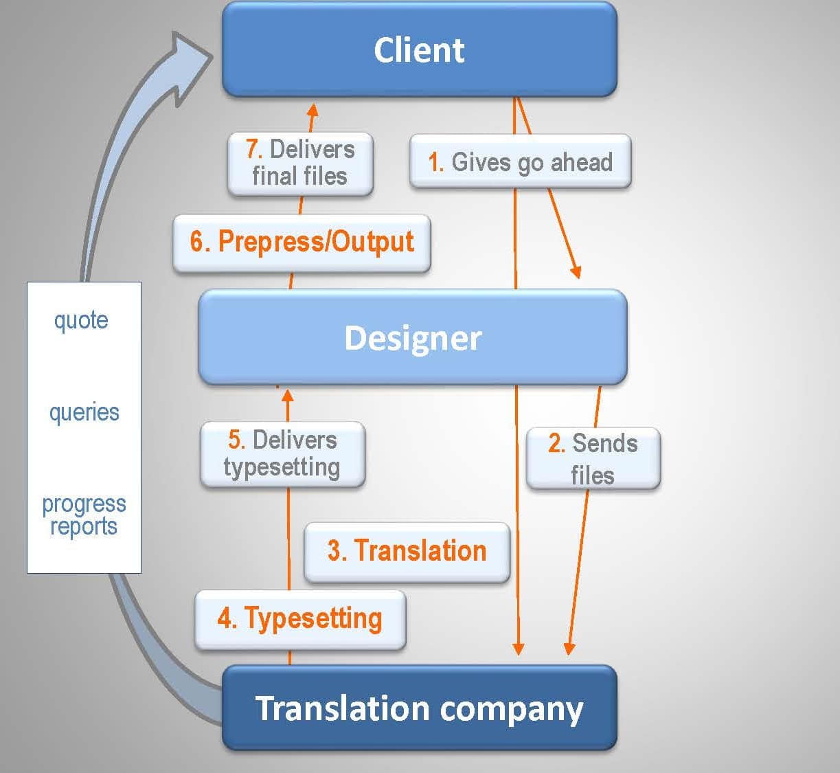
Here are the steps in the process:
Step 1. Client gives go ahead to Designer and Translation House
Step 2. Designer forwards files to Translation House
Step 3. Translation
Step 4. Typesetting
Step 5. Translation House sends typeset files to Designer
Step 6. Designer checks files, produces output
Step 7. Designer delivers final artwork to Client
Alternative processes
1. Separate translation and typesetting providers
Using different providers for translation and typesetting adds some complexity.
There’ll be an additional company to deal with, so you’ll need to make sure everyone is on the same page as to who is doing what and when.
The project will likely take a little more time than if you were dealing with a single provider.
Here are the steps in the work flow:
Step 1. Client gives go ahead to Designer, Translators, Typesetters
Step 2. Designer forwards files to Translators and Typesetters
Step 3. Translation
Step 4. Translators deliver translations to Client; Client forwards these to Typesetters
Step 5. Typesetting
Step 6. Typesetters send typeset files to Designer
Step 7. Designer checks files, produces output
Step 8. Designer delivers final artwork to Client
Schematically: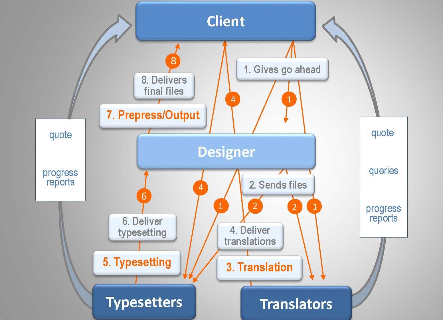
2. Using individual translators
The process is the same as for two companies, but you’ll be dealing with several translators rather than a single company.
The big challenge is how you ensure the translations are high quality. A reputable translation company will use professionally qualified translators and a proven process that includes a second translator review. Will your translators and processes be of similar standard?
Any doubts, and you may want to add an additional QA process after the translation step to ensure your translations are complete, accurate and well worded.
Also take care that they’re provided in the format the typesetters want.
This scenario will mean:
- significantly more involvement for you in project management
- a longer turnaround
- more potential areas for things to go wrong.
Because it adds risk, we suggest considering this structure only where you see clear advantages in using your own translators over a reputable translation company.
And take care that too many cooks don’t spoil the broth!
3. Adding an independent translation review
This is where you use a translation house to do the translations, have these reviewed by third party reviewers, then the translation house completes the typesetting.
If you’re considering this process, we strongly recommend you read this key article on doing a translation review before starting – there are things you’ll need to think through, key steps to take, and some common traps to avoid.
A poorly structured review can easily add complexity, time and therefore cost, and not produce the result you want.
To avoid that, you need to be crystal clear what you want the review to achieve, how to go about it, and closely manage the process to get that result.
Here is the process:
Step 1. Client gives go ahead to Designer and Translation House
Step 2. Designer forwards files to Translation House
Step 3. Translation
Step 4. Translation House sends translations to Client; Client forwards these to Reviewers
Step 5. Translation Review
Step 6. Reviewers deliver finalised translations to Client and Client forwards these to Translation House. (Alternatively, Reviewers provide suggested changes for Translation House to consider and finalise the translations)
Step 7. Typesetting
Step 8. Translation House sends typeset files to Designer
Step 9. Designer checks files, produces output
Step 10. Designer delivers final artwork to Client
Schematically: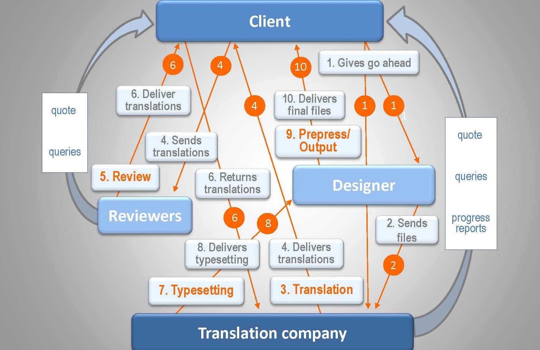
As you can see, this scenario:
- adds further layers of complexity
- will involve you in more work
- adds time to the project.
We’d suggest conducting an independent review only if you have a compelling reason for doing so.
That’s because a reputable translation company will already have carried out a second translator review of the translations.
This is:
- considered best practice,
- prescribed in various Standards,
- designed precisely to ensure all translations are top quality and fit for all purposes.
We refer to it as our “quality-assured translation” service.
So any additional review will essentially double up on something that has already been done by experienced professionals as part of a proven translation process.
2 key tips when getting a translation review:
1. Do the reviews before, not after, the typesetting
Any changes to text after it has been typeset will involve double handling, delay the project and likely incur additional charges.
2. Avoid the common pitfalls in getting a translation review
It’s amazing how easily a review process can come unstuck!
Make sure:
- you clearly define what your reviewers are to do (and not do)
- they have the required skillset to do the job
- everyone is clear who has final responsibility for the texts
Our article has more information on this.
It is also possible of course to engage your own translator and independent reviewer in each language, and use a translation house just for the typesetting.
As this will involve you in much more work, you’ll want to have clear reasons for opting for this process over the simpler and faster options.
How to avoid multilingual dtp designs that won’t work in other languages
Watch our video if you prefer:
There are four areas designers should think about when designing materials for multilingual treatment.
In descending order of importance these are:
1. The battle for Space – the No. 1 multilingual dtp design issue
This is the biggie. In fact, it’s HUGE!
That’s for 4 reasons:
A. Translations almost always expand from the original text
A 10-20% increase in word count going from English into European languages is normal.
30% or more is not unusual, and some languages expand even more – the Polynesian languages, Vietnamese, and sometimes Indonesian/Malay for example.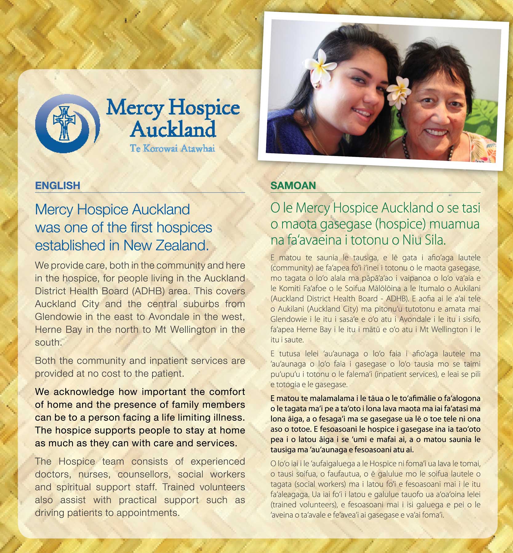
In the example here (click to enlarge), see how the 19 lines of English body text has expanded to 25 in Samoan, even after significantly reducing the point size!
Further, a single succinct caption, heading or title may require several more and/or longer words in translation.
That may mean needing more horizontal space, or running it over an additional line or lines.
B. Many languages need greater leading than European languages
The Latin script we’re familiar with is vertically compact, but most other scripts aren’t.
Almost all Indian languages take up more vertical line space, for example. So too do Thai, Lao and Khmer.
Then there are Burmese, Amharic, Armenian…
And even Arabic which looks like it should occupy similar vertical space to English often needs greater leading to avoid lower diacritics on one line overlapping with upper diacritics on a following line.
Check out this Khmer example:
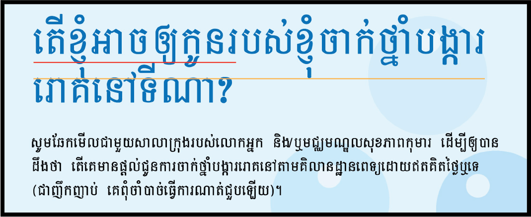
In the heading, the yellow line marks the bottom of the top row of text, the red line marks the top of the second row.
Replacing the English text without increasing the leading has produced significantly overlapping lines.
This is jarring and looks very unprofessional to a Khmer reader – much greater separation between the lines is needed.
In contrast, the body text below the heading has appropriate leading and looks fine.
C. Some languages need bigger point sizes
You might get away with 6 or 7 point in an English font, but try that in an equivalent Chinese or Japanese font and the multiple stroke characters will “fill in” and be difficult to read.
In the image below, at actual size (not enlarged) the text on the left is hard to read, the middle is reasonable, and the right is comfortable.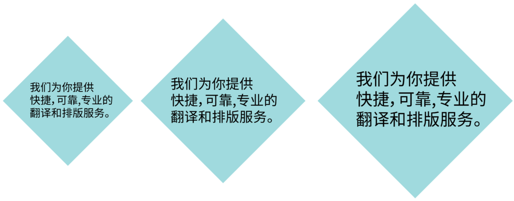 Generally, the more complex the script (the more lines or strokes it has) the larger your minimum point sizes must be.
D. Many languages use longer words than English
Classic European language examples are Finnish, German and Russian, but also the Romance languages – French, Spanish, Italian etc.
– User
– Käyttäjä
– Benutzer
– Utilisateur
– Пользователь
This can make typesetting captions and headings in tight spaces difficult.
It can also be a problem in narrow text boxes where hyphenation becomes necessary:
– lots of hyphenation looks harsh and is more difficult to read,
– too little can create a ragged look with varying line lengths and inter-word spacing.
It can be difficult to get the text looking good.
Have a look at this example:
And how to solve these little dilemmas
Multilingual typesetters are adept at manipulating text to fit the available space.
But if a particular language text simply won’t fit without things looking cluttered, they’ll need to alter your design elements to create more space – or ask you to do it.
That’s something best avoided if possible – you won’t want your work changed, typesetters know they’re not designers, and clients typically want consistency across the different language versions.
If you can design to accommodate greater text volume everywhere, you’ll make the multilingual typesetters’ job easier and help produce a better overall result in the other languages.
Your checklist:
- Ensure there is space for text boxes to be enlarged if needed
- Avoid very small point sizes and tight leading – we may need to increase both for the foreign language text
- Ensure titles, headings and captions can expand horizontally, and potentially run to an extra line
- Expect text in graphics to need more space in translation
- Avoid narrow text boxes and columns
2. When your fonts may not be the best choice
Multilingual typesetters will typically have to change a document’s fonts for languages in other scripts – Chinese, Japanese, Korean, the Indian languages, several South East Asian languages, for example.
But if possible, they’ll want to keep your original fonts for all languages that use the Latin (Roman) script.
This provides consistency across language versions and avoids any difficulty matching the style of fonts you’ve used in the original.
The problem
However, not all fonts have the extended character sets needed to handle the accented and unique letters found in many languages.
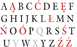
Letters like the ą, ć, ę, ł, ń, ś, ź, ż in Polish, the glottal stop and stress mark diacritics in Polynesian languages, or Cyrillic and Greek letters, for example.
And bear in mind that if you use particularly stylish or quirky fonts, these are unlikely to support some languages, so the effect you’ve created may be difficult to replicate in other language versions.
Our recommendation
Fortunately, Unicode and the more standard Mac and PC fonts typically cover a wide range of languages. Sticking with these in your documents should avoid any issues and make the typesetters’ job easier.
4 ways to confirm a font supports numerous languages (so is good for multilingual dtp):
1. the Details tab for a font in Adode Fonts
2. the font description in FontShop
Both of these give a list of supported languages.
Our tip: any font that supports Polish, Russian and Greek is likely to be ideal for multilingual dtp.
Another measure is the number of languages supported – a hundred odd is good for multilingual dtp, only 50 will mean many important languages won’t be.
3. a Google search for ‘[font name] font languages’
4. Character Viewer (Mac) or Character Map (Windows) to see what characters a font supports.
Our tip: look for the letter ‘ą’ (small ‘a’ with ogonek), if it’s there that font is highly likely to support a wide range of languages and be great for multilingual dtp.
3. Graphics can be great in one culture, grate in others
The challenge here is ensuring your graphic elements will have the effect and appeal you’re after in other cultures.
The ideal is to use images with “universal” appeal and impact, but that can be easier said than done.
It means avoiding any culturally specific subject matter – customs, food, pastimes, sports, etc.
But it also extends to landscapes, fauna and flora – a typical scene in one country may be far from typical in another, and many animals have different connotations across cultures.
And then there are the people in the photos you use – will other cultures relate to those faces in the way you want?
These are all things to bear in mind and potentially discuss with your client. And of course, clients will sometimes be happy to change out photos or images for different language versions.
D. Complex design elements – can they be easily unpicked?
Multilingual typesetters will seldom mess with your design – that’s the last thing they’d want to do!
However, there is one case where they will need to:
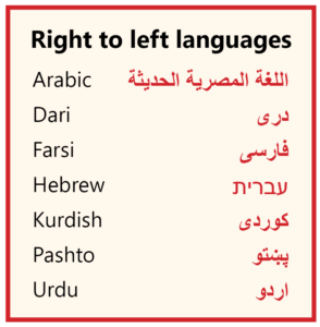
When working with right to left languages – Arabic, Farsi/Dari, Hebrew, etc.
These languages read from right to left – the opposite to English.
This means some elements will need to be flipped, others moved from one side to the other, and most text will become right rather than left justified.
For example:
Note: the Middle Eastern version of InDesign has built in functionality for reversing the layout, so leave this to the multilingual typesetters rather than do it yourself.
So how does this affect your design?
Generally it won’t, but if you’re working with complex design elements bear in mind that these may have to be ungrouped and individual elements moved or flipped later by the typesetter. The easier you can make that, the less chance of error.
The hidden traps to typesetting foreign language text
It can be tempting to want to typeset foreign language texts yourself.
If you know the language, that’s fine. But if you don’t, there are some inherent risks.
Here are the three most common mistakes we see:
- certain letters/characters displaying incorrectly
- using fonts that aren’t suitable or lack impact
- not following layout conventions for that language
Commit any of these, and you’ve just killed the effectiveness of the publication on the target audience.
And not knowing the language, you’ll be blissfully unaware of the mistakes you’ve made…
That said, not all languages are equal for multilingual desktop publishing. Some are relatively straightforward, whereas others require specialised knowledge.
Here is our breakdown of the areas to watch for different groups of languages we commonly work with.
Straightforward languages for multilingual dtp
Languages that use the Latin (Roman) script
Typesetting these languages is less problematic. That’s because their design aesthetics, layout conventions and font usage will likely be much the same as for English.
However there are 4 issues to watch:
- Some English fonts won’t have all the characters needed for all languages, as discussed above.
- Some individual letters may display incorrectly when all other letters are correct – French œ and German ß, or Polynesian language glottal stops and stress marks for example.
- Numbers may need editing. For example, English 1,234.56 is 1.234,56 in many other languages.
- Hyphenation must follow the rules for that language, as words cannot be broken in any position.
For an extensive list of languages that use the Latin script, see: https://en.wikipedia.org/wiki/List_of_languages_by_writing_system
Greek
The same four issues as above.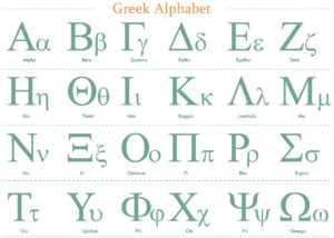
In addition, be aware of the following Greek punctuation marks that differ from English:
- ; (an English semicolon) is a question mark
- a point above the line (·) is the equivalent of an English semicolon
- quotation marks are « »
Cyrillic languages
Cyrillic script is used for Russian of course, but also for some 20 odd other languages.
Many of these use additional characters not found in Russian, and some fonts will support Russian but lack the glyphs needed for other languages.
So you need to take particular care that all letters are displaying correctly.
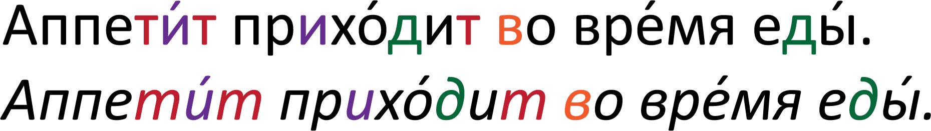
It also pays to know how letters change shape when italicised in Cyrillic languages. For example, compare the standard and italicised forms of the letters ‘и’, ‘д’, ‘т’ and lower case ‘в’ in this Russian text:
Key tip:
If you’re brave enough to typeset a language you’re not familiar with, get someone who is to check and sign off your typesetting – ideally the translator responsible for that language text.
Languages needing specific expertise for multilingual desktop publishing
Typesetting any other script or character-based language is more complicated. You’ll need to:
- have a range of fonts
- know which fonts are appropriate for your publication
- understand text layout conventions in that language
and you may well also need:
- specific techniques or workarounds to overcome known issues in the language
- additional software
It certainly isn’t just a matter of pasting in the text, changing the font, and tweaking the layout – that could be disastrous!
Even if you avoid text errors, you could end up creating artwork that is unappealing, and even off-putting, to the target audience.
We strongly recommend leaving the typesetting of any language that uses a different script to the experts.
Here are the key issues for some of the main languages
Chinese, Japanese & Korean
- Font usage – having the right style of font is very important in these cultures.
- Using different font weightings for effect.
- Alternatives to italicising – these languages generally don’t italicise, so different strategies for creating contrast are needed.
- General text and page aesthetics – what looks good on a page. For example, Chinese favours neatly aligning text and the effect of white space on the page is important.
- Line start/end conventions – certain characters shouldn’t start or end a line.
Thai, Lao, Khmer
- Correct display of text, and especially diacritics – there is a known issue with “floating diacritics” in Thai, for example.
- Appropriate fonts.
- Where to break lines – these languages generally don’t have spaces between words, but lines must wrap at the end of a word, not mid-word.
- Point sizes and leading – lines take up more vertical space than European languages so need greater leading. But point sizes cannot be too small or the text will be hard to read.
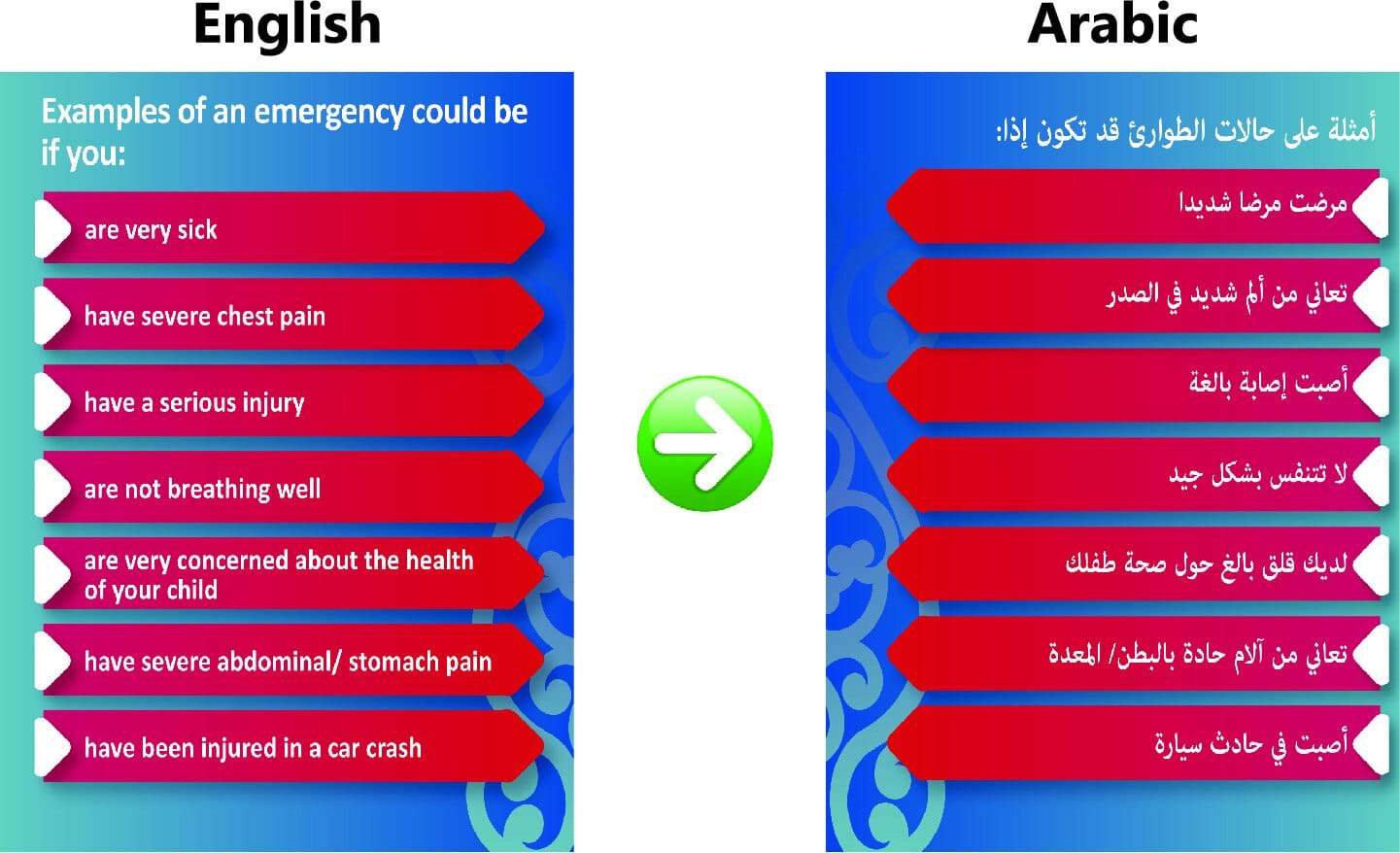
Arabic, Hebrew and other right to left languages
- Reversal of page layout due to text direction
- Software to handle R – L text direction
- Justification – mostly right, sometimes centre, virtually never left.
- Correct display of numbers – should it be Arabic or Hindi numerals?
- Correct word order of English words included within R – L text
- Adequate leading – so lower diacritics on one line don’t overlap with upper diacritics on the next line
See our Arabic translation and typesetting page for further information.
Indian languages
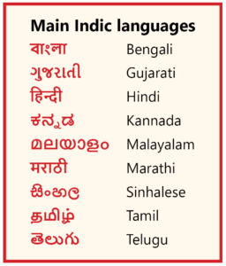
- Getting text to display correctly – through World-Ready Composer settings, additional software and specific workarounds for incorrect rendering of certain glyph combinations
- Appropriate fonts
- Correct display of numbers
- Adequate leading – greater vertical space per line is needed in many Indian languages
Our Hindi translation and typesetting page gives further details.
Burmese
Nothing about Burmese is straightforward!
These are the main problem areas:
- Correct text display – there are major issues with individual letters and letter combinations rendering incorrectly in graphic design programs.
- Fonts are not interchangeable (due to different underlying encoding).
- Bolding – few fonts have alternative weightings.
- Fitting text into the available space – significantly greater leading than English is needed.
- Word wrap and hyphenation.
We hope we’ve convinced you multilingual typesetting should be left to the experts – that’s us!
So let us quote for your project – we’ll do a superb job!
Just e-mail us a pdf of your artwork and tell us the languages,and we’ll get right back to you.
Like a free e-book of this guide?
Be sure to jump on our mailing list!
You’ll get proven, highly practical and quick-read tips for achieving better translation results, direct to your inbox.
Great value for just 20 seconds of your time, once a fortnight. Read more here.
Check them out at the Key articles for clients list on our main blog page.Or start by having a look at these ones:
The HUGE list of 51 different types of translation – and what they all mean
![]()
Realistic translation times – knowing how long a quality translation will take
What we mean by translation quality and a simple method for assessing it
![]()